Overview
The Grading Portal was initially developed as a quick solution for customers to manage their grading requests without design thinking leading to problems with consistency, usability and more.
I collaborated with the product owner to align on the vision, aiming to future-proof the portal with a modern, scalable design that would solve the design problems of the system.
During user research, we identified previously unknown pain points, prompting us to urgently expand the team and develop a bespoke online results system, all while managing fast-tracked feature requests from the business.
Our research efforts uncovered upsell opportunities, for unsold grading results that were not shown to customers increasing revenue from the portal by 4.1%.
My Role
Product Designer — UX/UI Design,
Front-end Templates, Design System
Team
Alex Cox, Product Owner
Zakaria Zakaria, Lead
Deashen Reddy, Quality Assurance
Sivan Siman, Developer
Mujaahid Mullagee, Developer
Randal Manickum, Developer
Olwethu Ntshinga, Developer
Highlights


Context
New beginnings with a new team
At the start of 2023 our team came in to replace the previous development team (who had been operating without a designer). The project manager had requested a UX Designer to sense check any of the new features we would be releasing
Research
Establishing a strategy
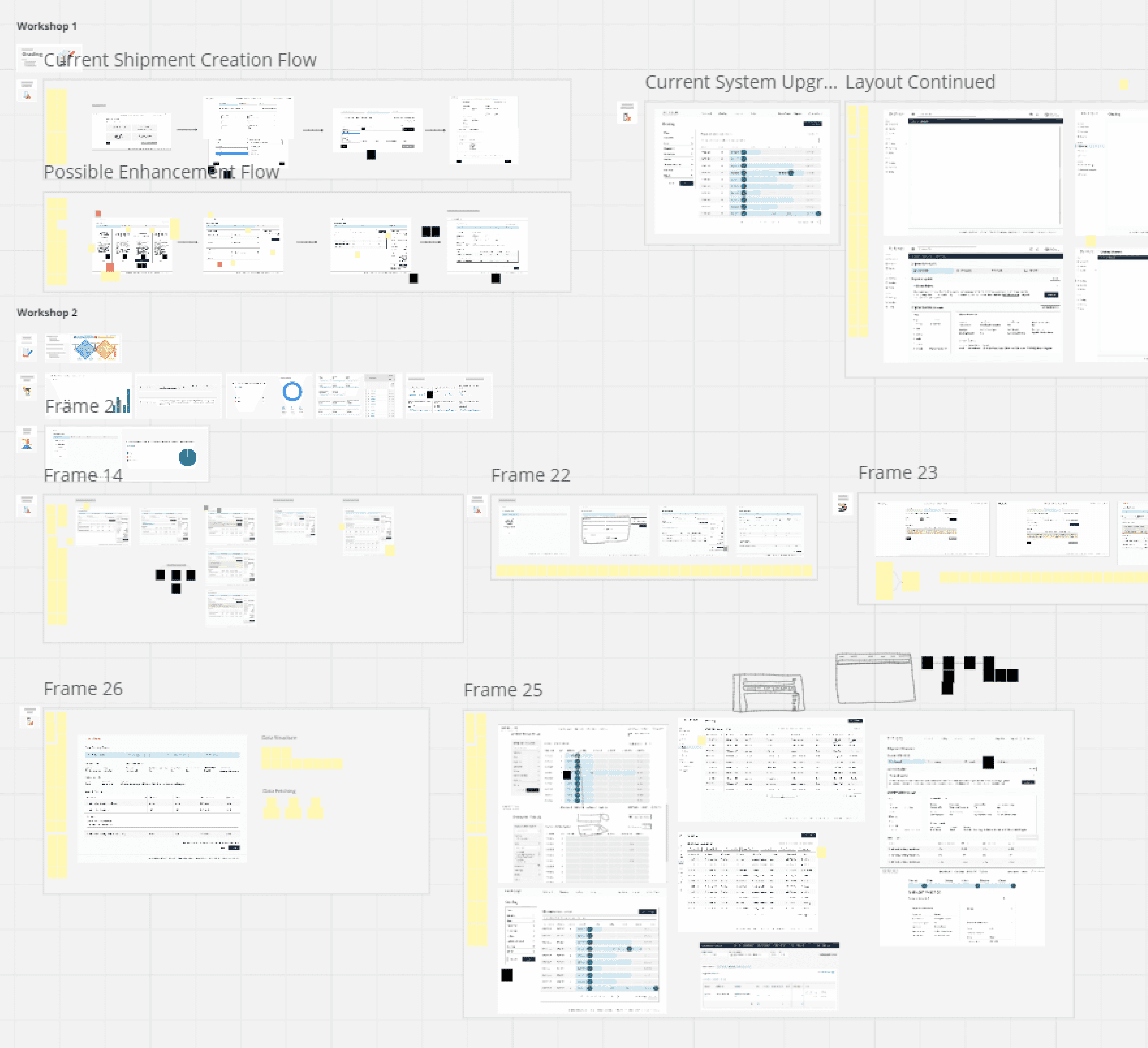
I used Miro to build out a roadmap. Since I needed to be available for ad hoc features, I wanted something to keep me on track when I had to step back into the old system for rapid enhancements.

Getting to know the users
I sent out surveys to gauge approval of the current system and to start gathering requests from our user base. Next, I conducted user interviews with the primary types of users on the system: account managers, customers, and the internal grading team.

Design Audit
A Review to Set the Stage
Starting the project without a figma file meant there was some additional work before diving into design, I conducted a comprehensive audit of the existing project to establish a solid baseline.
Reviewing all current designs, identifying inconsistencies, and establishing a clear understanding of the project's strengths and weaknesses
Problem Areas


UI Toolkit
With a checklist of issues to address, my first task was to unify DeBeers’ digital identity. I began by reaching out to other product teams to understand what they were doing well and to form a cohesive vision of what a DeBeers app should look like.

Redesign
Transforming Vision into Reality
Workshops and iterative design
With a toolkit ready, we began challenging our assumptions and building a vision for the Grading Portal.
These workshops not only led us to our solution but also fostered a collaborative environment where trust between our team and PO could grow, making them feel like a valued member of the team.
"Iteration is the key to mastery; with each pass, we eliminate flaws and uncover new paths to excellence." - Sun Tzu

Something was wrong
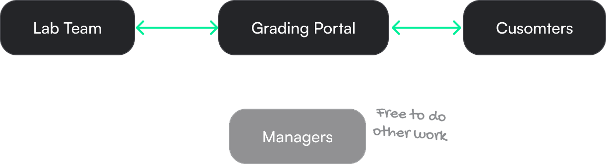
During our research for the redesign, we noticed serious pain points with confirming grading results and conducted follow-up research to understand how to improve user communication with the labs.
Users were entirely reliant on email communications, downloading and editing Excel files that account managers had to juggle between the labs and customers before final approval for inscription could be given.
How was it working?

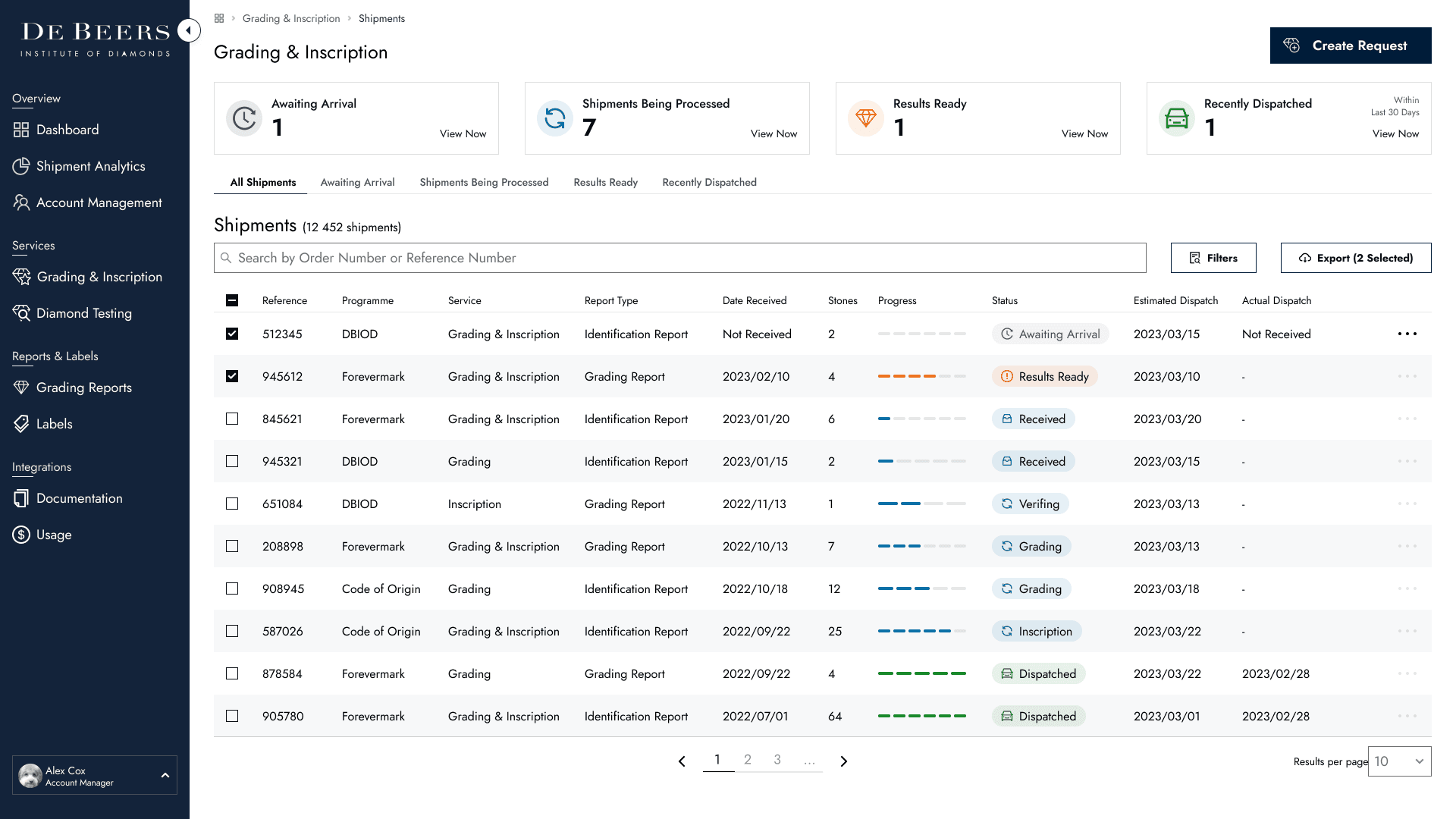
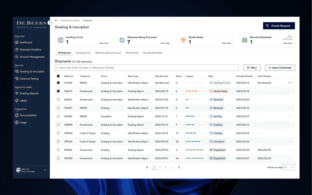
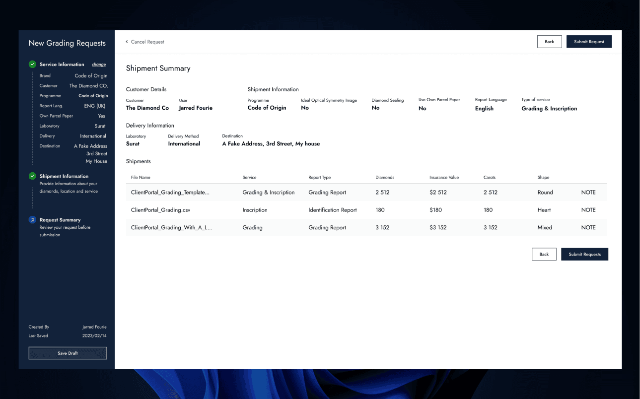
The Solution
Enable the Grading Portal to be the source of truth and do the heavy lifting to free up some time for the managers.
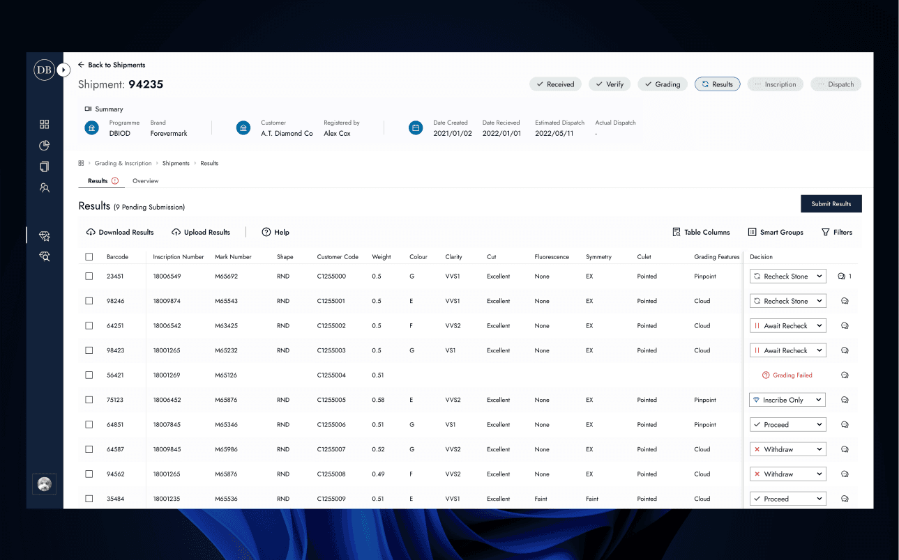
Online Results
Get online, its the 21st century
With a flow designed to improve the user experience, we were ready to develop a feature that we tested and refined extensively using an Angular demo of the app I built. The result was a clear, intuitive workflow that met the needs of all our user groups.
at least when making this...
Up Next